Inman News
Making Sense Of The Headlines: Windermere Chief Economist Matthew Gardner dives deeper into the lesser known components of the Case-Shiller Home Price Index and what they can tell us about the health of the market.
There’s an overwhelming amount of data and headlines circulating. This column is my attempt to make sense of it all from an overall economic standpoint.
Let’s take a look at the Case-Shiller Home Price Index today. Now, of course, I am sure that most of you watching will be very familiar with this index. But today we are going to take a deeper dive into some of the lesser known components of it and, of course, talk about the latest numbers that came out last week.
A little background
To start with, it’s important to fully understand what the Index is and how it works.
Below are the late Karl Case on the left, and Dr. Robert Shiller on the right. The story starts back in the 1980s when Case was studying home price changes in Boston as they were going through a price boom back then.
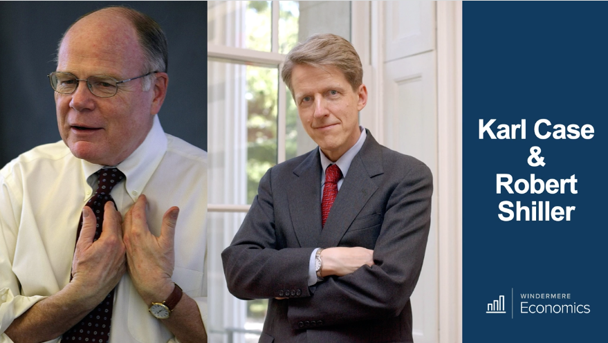
He met up with Shiller in 1985 who happened to be researching economic bubbles at the time. One thing led to another, and they ended up formulating an index that looked at home price changes in Boston as well as other cities across the U.S.
A little later, a gentleman called Allan Weiss got together with them and talked them into forming a company — Case Shiller Weiss — to publish the index and sell the data to the market.
Long story short, they sold the company to Fiserv who, along with Standard & Poor’s, developed tradable indices based on the data. And now you can actually trade Case-Shiller options and futures on the Chicago Mercantile Exchange.
Later, Fiserv sold to CoreLogic, so we now have the S&P CoreLogic Case-Shiller Home Price Index. Just rolls off the tongue, doesn’t it? Anyway, that’s the who, now the what.
How it works
I, along with many other economists find this index very useful as it’s a repeat sales index. This means that, rather than simply looking at the average or median sale prices in a period, it looks at the sale of the same house over time, which is a little different than other indices.
For example, let’s say you bought your home in 2010, and you sell it in 2020. This index looks at the difference between the two values, rather than just lumping the most recent sale price in along with all other transactions and then comparing that to sales that happened in the prior month, quarter, year or whatever.
In addition, it cleans the data by only including arm’s length transactions. It ignores “flips” where the home trades more than once in a six-month period. And finally, it removes suspect data — where there might be something strange, like maybe the spread between the purchase and sale prices is well above the market, which might indicate a renovated property.
It breaks the data up into three price tiers: low, middle and high.
So, these are the cities that make up the index. In addition to looking at these cities separately, it prepares the Composite-10 and Composite-20 indices. The Composite-10 are the cities on the left, and the 20 are all of them.
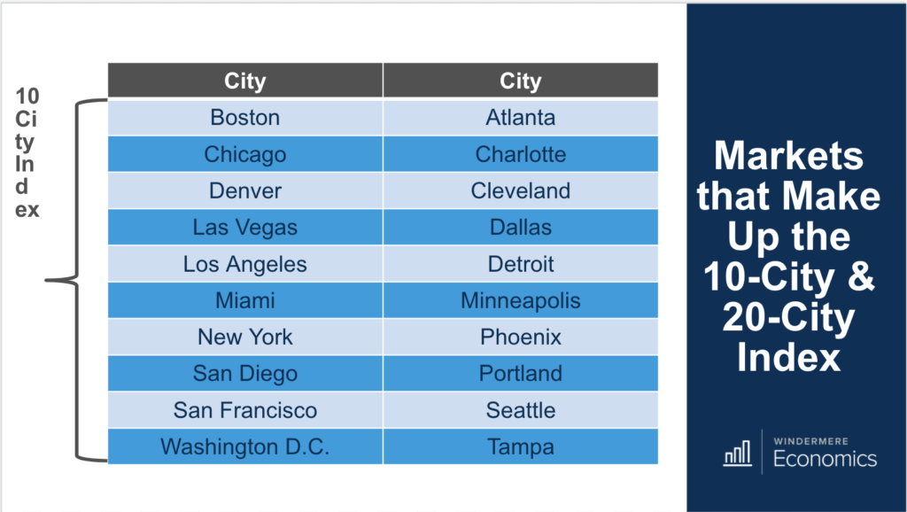
There’s also a National Index that uses data across the nine U.S. census divisions.
The numbers
Let’s look at the most recent data and what it’s telling us.
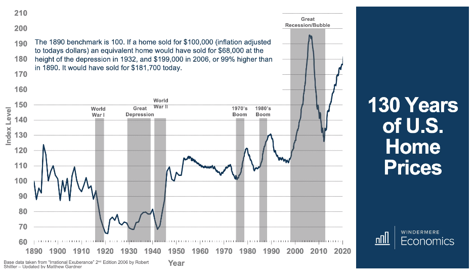
Before we start in on the latest numbers, take a quick look at Shiller’s index data on home prices going all the way back to 1890. I’m not going to go through it other than to say that I adjusted the index for inflation but not seasonality, and one think you can clearly see that the current level is well below the level seen before the housing bubble burst, which suggests that, at least at a national level, home prices still have room to rise.
Moving on to more contemporary data. Below, the chart on the left shows the 12-month change in the 20-city index level over time, and you can see the bubble inflating, bursting, spiking again because of the homebuyer tax credit — slowing again when it expired in 2010 — but then going through a massive period of growth starting in 2012 through 2014.
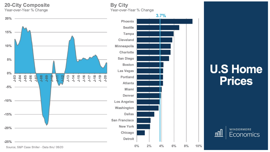
This growth was no more than a “snap back,” as homes in much of the country were still undervalued, confidence in the U.S. housing market had been restored, and we started to create new households again. In 2014, the pace of growth became unsustainable, and we pulled back to around 5 percent for the next few years.
We saw a tangible slowdown in 2018 when mortgage rates started to rise from 4 percent to almost 5 percent. But the index started to pick up a little last year. The latest figure shows an annual increase of 3.7 percent.
So looking now, still above, at the chart on the right, you will see the rate of change for the 20 cities within the index over the past 12 months.
And here, you’ll see that Phoenix and Seattle are leading the way with their respective index levels up by 9 percent and 6.8 percent, and all bar five markets tracking at or above the 20-city average.
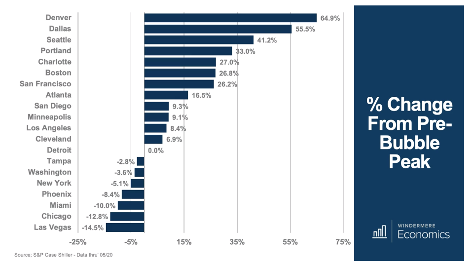
Interestingly, and as shown here, there are still seven markets — Tampa; Washington, D.C.; New York; Phoenix; Miami; Chicago; and Las Vegas where the index level is still below the pre-bubble peak.
You can see that there is a lot of good information to be had in this data, but I’m going to take it a little further and, for the purposes of this discussion, I’ll pick on San Francisco and Seattle.
So, I mentioned earlier that Case-Shiller also breaks down the index level by tiers based on the price that the house traded for before the most recent sale. And here is the data for the Bay Area with one or two notes.
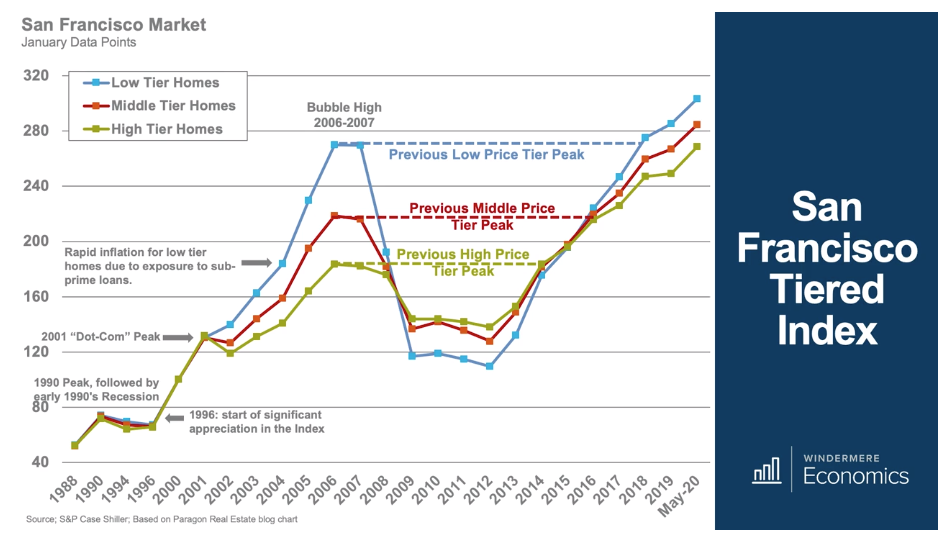
And as we look back in time, all three components of the index were very tight in the late ’80s and early ’90s.
The market started seeing significant growth in 1996, but all tiers, again, were in sync. When the dot-com recession hit, the high-end market — unsurprisingly — got smashed, but cheaper homes managed to skirt the drop and, because of lax lending practices, the low tier started to rise at a far faster pace than either the middle or high tiers.
Well, you can see that, when the bubble burst, all three tiers dropped precipitously before leveling out in 2009. After that, they really didn’t go anywhere until 2012, but that was the start of a trend that has been very robust until we get to where we are today.
But of greater significance are the current levels relative to their 2007 peaks.
Affordability — or lack thereof — has led the lower-price tier to index levels higher than the middle or upper tiers, but all are significantly higher than the prior peak. This suggests that not only is affordability an issue across the board, but also that prices cannot keep appreciating at current rates.
And finally, this chart uses Seattle aggregate index data and places it against different interest rates over time. I think that this is a useful tool for those who are suggesting that we are in another bubble.
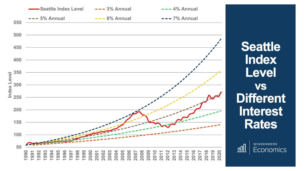
As you can see, the index itself peaked in 2008 and was roughly at the same level as the 7 percent annual growth rate line, which tells us that between 1990 and 2008 the average annual rate of growth was around 7 percent.
Of course, the market bursting led the index to drop to the 4 percent mark, but even though we have seen solid increases in the index from 2012 until now, we are still tracking at a sustainable rate of 5 percent.
So, there you have it: the Case-Shiller Index.
A few things you should know
Although it was the among the first of its kind to measure prices of homes based on repeat transactions, it isn’t perfect.
First, the Index only looks at single-family homes — now it does have some data on condominiums, but only in a few markets and not nationally. It also ignores new construction.
Second, the index number itself is calculated monthly using a three-month moving average, and it’s also reported with a two-month delay — meaning that in late July, we’re getting a picture of home prices for the three months ending in May.
Third, the index is based on closed transactions and, as you are all aware, those transactions typically go to contract one to three months earlier. So, in late July, we’re getting a picture of what the housing market actually looked like from February to April.
And finally, the 20-city index is what’s called “value weighted” — and what this means is that changes in the prices of more expensive homes in coastal California, the New York metro area, or even here in Seattle can heavily influence the overall index.
But all that said, the Case-Shiller Index is very significant, and it’s worth keeping a very close eye on the numbers. Along with all the other data you keep tabs on, it’s another tool in your personal arsenal.
Matthew Gardner is the chief economist for Windermere Real Estate, the second largest regional real estate company in the nation.