CALCULATEDRISK
Price-to-rent index is 8.4% below recent peak
By Bill McBride
It has been over 17 years since the bubble peak. In the April Case-Shiller house price index, the seasonally adjusted National Index (SA), was reported as being 62% above the bubble peak in 2006. However, in real terms, the National index (SA) is about 11% above the bubble peak (and historically there has been an upward slope to real house prices). The composite 20, in real terms, is 1% above the bubble peak.
The inflation adjusted indexes increased in real terms in April using CPI ex-shelter.
People usually graph nominal house prices, but it is also important to look at prices in real terms. As an example, if a house price was $200,000 in January 2000, the price would be $341,000 today adjusted for inflation (70.5% increase). That is why the second graph below is important – this shows “real” prices.
The third graph shows the price-to-rent ratio, and the fourth graph is the affordability index. The last graph shows the 5-year real return based on the Case-Shiller National Index.
Nominal House Prices
The first graph shows the monthly Case-Shiller National Index SA, and the monthly Case-Shiller Composite 20 SA (through April) in nominal terms as reported.
In nominal terms, the Case-Shiller National index (SA) and the Case-Shiller Composite 20 index (SA) are both below all times highs set in June. Both indexes increased slightly in April, with the National index off 1.8% from the recent peak, and the Composite 20 index off 3.3%.

Real House Prices
The second graph shows the same two indexes in real terms (adjusted for inflation using CPI less Shelter). Note: some people use other inflation measures to adjust for real prices. CPI less shelter has only increased at a 1.0% annual rate over the last ten months, and that has kept real prices from falling sharply.
In real terms (using CPI less Shelter), the National index is 3.8% below the recent peak, and the Composite 20 index is 5.2% below the recent peak in 2022.

In real terms, national house prices are still above the bubble peak levels. There is an upward slope to real house prices, and it has been about 17 years since the previous peak, but real prices are historically high.
Price-to-Rent Ratio
In October 2004, Fed economist John Krainer and researcher Chishen Wei wrote a Fed letter on price to rent ratios: House Prices and Fundamental Value. Kainer and Wei presented a price-to-rent ratio using the OFHEO house price index and the Owners’ Equivalent Rent (OER) from the BLS.
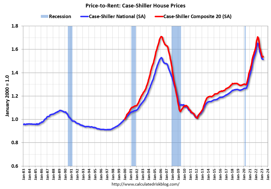
Here is a similar graph using the Case-Shiller National and Composite 20 House Price Indexes. This graph shows the price to rent ratio (January 2000 = 1.0). The price-to-rent ratio had been moving more sideways but picked up significantly following the onset of the pandemic.
On a price-to-rent basis, the Case-Shiller National index declined again in April for the eleventh consecutive month. The price-to-rent index for the National index is off 8.4% from the recent peak, and the Composite 20 based index is off 9.8%.
By all of the above measures, house prices are elevated.
Calculated Risk Affordability Index
I’ve put together my own affordability index – since 1976 – that is similar to the FirstAm approach (more of a house price index adjusted by mortgage rates and the median household income).
I used median income from the Census Bureau (estimated 2022 and 2023), assumed a 15% down payment, and used a 2% estimate for property taxes, insurance and maintenance. This is probably low for high property tax states like New Jersey and Texas, and too high for lower property tax states. If we were including condos, we’d also include HOA fees too (this is excluded).
For house prices, I used the Case-Shiller National Index, Seasonally Adjusted (SA).
Also, for the down payment – there wasn’t a significant difference between 15% and 20%. For mortgage rates, I used the Freddie Mac PMMS (30-year fixed rates).
So here is what the index looks like (lower is more affordable like the FirstAm index):

Affordability was slightly better in April than in March, as house prices increased, however mortgage rates decreased. In October 2022, houses were the least “affordable” since 1982 when 30-year mortgage rates were over 14%.
Note that by this index, during the early ‘80s, homes were very unaffordable due to the very high mortgage rates. During the housing bubble, houses were at about the same level of unaffordability using 30-year mortgage rates, however, during the bubble, there were many “affordability products” that allowed borrowers to be qualified at the teaser rate (usually around 1%) that made houses seem more affordable.
Here is a graph showing affordability, and the 5-year real return (red) on the house purchase (annualized). The 5-year real return is the future return on the Case-Shiller index, adjusted for inflation.
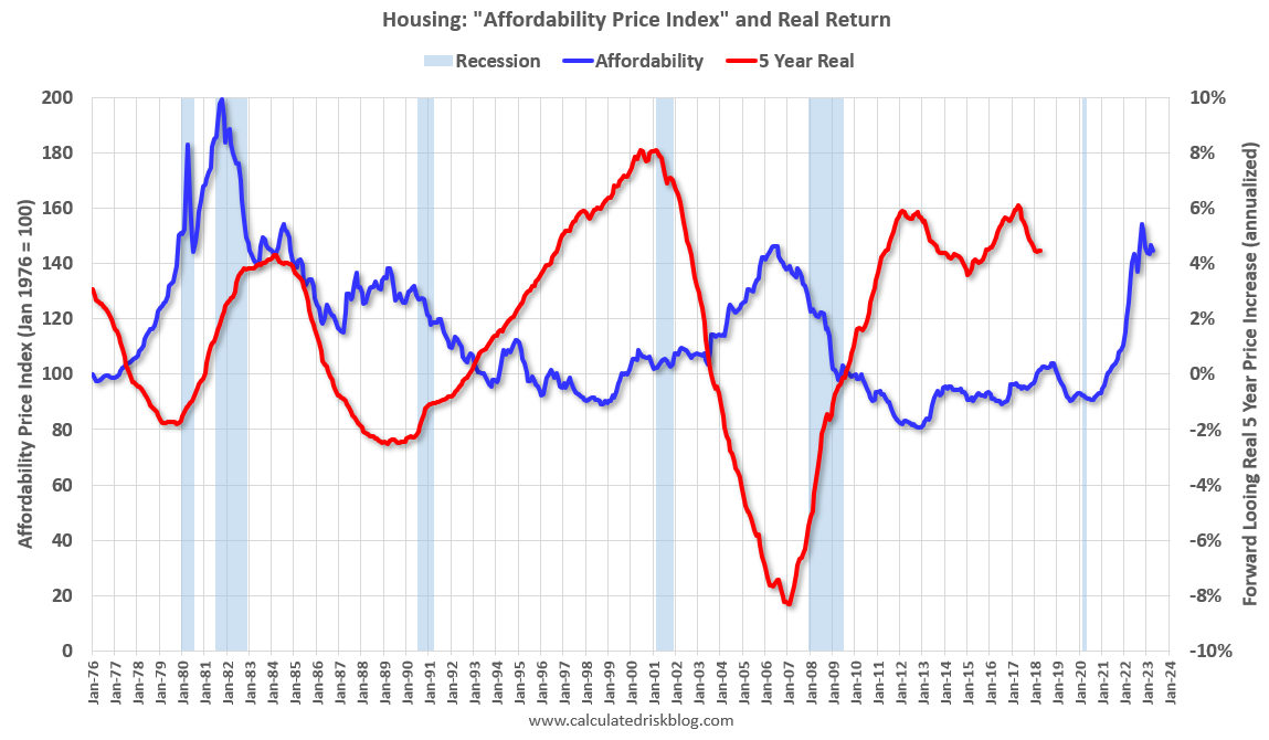
When affordability was poor in the early ‘80s, it was actually a good time to buy (and that was before refinancing!). Another good time to buy was in the mid-to-late ‘90s. And another good time was around 2011 or 2012 (When I wrote The Housing Bottom is Here) and also the next several years. The worst time to buy (using a 5 year real return) was in the runup to and during the housing bubble.
Since the real return is based on 5 years, we don’t know the return after April 2018.
Note: The average 30-year mortgage rate in April was 6.34% (according to the Freddie PMMS including points), and increased to 6.43% in May, so affordability, by this measure, likely worsened in May (rate increased further in June).
Unaffordability and the low level of inventory are pushing prices in opposite directions!