Calculated Risk
Price-to-rent index is 7.1% below recent peak
By Bill McBride
It has been 17 years since the bubble peak. In the December Case-Shiller house price index released on Tuesday, the seasonally adjusted National Index (SA), was reported as being 61% above the bubble peak in 2006. However, in real terms, the National index (SA) is about 11% above the bubble peak (and historically there has been an upward slope to real house prices). The composite 20, in real terms, is about 1% above the bubble peak.
These inflation adjusted indexes have been declining for seven months in real terms.
People usually graph nominal house prices, but it is also important to look at prices in real terms. As an example, if a house price was $200,000 in January 2000, the price would be almost $338,000 today adjusted for inflation (69% increase). That is why the second graph below is important – this shows “real” prices.
The third graph shows the price-to-rent ratio, and the fourth graph is the affordability index.
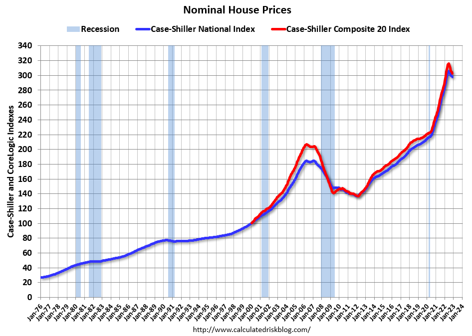
Nominal House Prices
The first graph shows the monthly Case-Shiller National Index SA, and the monthly Case-Shiller Composite 20 SA (through December) in nominal terms as reported.
In nominal terms, the Case-Shiller National index (SA) and the Case-Shiller Composite 20 index (SA) are both below all times highs set in June. Both indexes declined in December, with the National index off 2.7% from the recent peak, and the Composite 20 index off 4.4%.
Real House Prices
The second graph shows the same two indexes in real terms (adjusted for inflation using CPI less Shelter). Note: some people use other inflation measures to adjust for real prices. CPI less shelter has declined for two consecutive months, and that has kept real prices from falling even faster. Using CPI, instead of CPI less Shelter, real prices are down 4.9% from the recent peak.
In real terms (using CPI less Shelter), the National index is 3.9% below the recent peak, and the Composite 20 index is 5.6% below the recent peak in 2022.
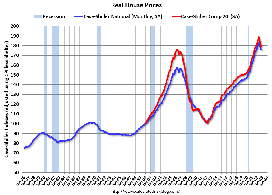
In real terms, house prices are still above the bubble peak levels. There is an upward slope to real house prices, and it has been about 17 years since the previous peak, but real prices are historically high.
Price-to-Rent Ratio
In October 2004, Fed economist John Krainer and researcher Chishen Wei wrote a Fed letter on price to rent ratios: House Prices and Fundamental Value. Kainer and Wei presented a price-to-rent ratio using the OFHEO house price index and the Owners’ Equivalent Rent (OER) from the BLS.
Note that OER is lagging behind other measures of rent.
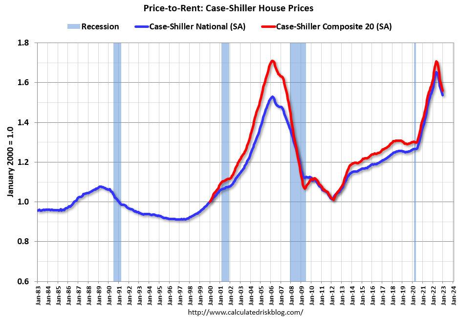
Here is a similar graph using the Case-Shiller National and Composite 20 House Price Indexes. This graph shows the price to rent ratio (January 2000 = 1.0). The price-to-rent ratio had been moving more sideways but picked up significantly following the onset of the pandemic.
On a price-to-rent basis, the Case-Shiller National and Composite 20 indexes declined again in December for the seventh consecutive month. The price-to-rent index for the National index is off 7.1% from the recent peak, and the Composite 20 based index is off 8.7%.
By all of the above measures, house prices are elevated, but declining.
Calculated Risk Affordability Index
I’ve put together my own affordability index – since 1976 – that is similar to the FirstAm approach (more of a house price index adjusted by mortgage rates and the median household income).
I used median income from the Census Bureau (estimated 2021 and 2022), assumed a 15% down payment, and used a 2% estimate for property taxes, insurance and maintenance. This is probably low for high property tax states like New Jersey and Texas, and too high for lower property tax states. If we were including condos, we’d also include HOA fees too (this is excluded).
For house prices, I used the Case-Shiller National Index, Seasonally Adjusted (SA).
Also, for the down payment – there wasn’t a significant difference between 15% and 20%. For mortgage rates, I used the Freddie Mac PMMS (30-year fixed rates).
So here is what the index looks like (lower is more affordable like the FirstAm index):
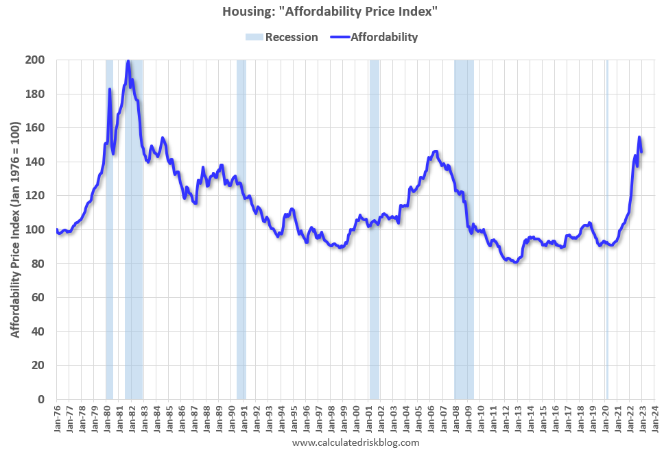
Affordability improved slightly in December as both mortgage rates and house prices declined. In October, houses were the least “affordable” since 1982 when 30-year mortgage rates were over 14%.
Note that by this index, during the early ‘80s, homes were very unaffordable due to the very high mortgage rates. During the housing bubble, houses were at about the same level of unaffordability using 30-year mortgage rates, however, during the bubble, there were many “affordability products” that allowed borrowers to be qualified at the teaser rate (usually around 1%) that made houses seem more affordable.
Note: The average 30-year mortgage rate in December was 6.36% (according to the Freddie PMMS including points), and decreased to 6.27% in January, so affordability, by this measure, improved in January – but was still very “unaffordable”.
Recently 30-year mortgage rates have moved back over 7%, so affordability will be worse in late February and early March.